Positioned in One Hiranandani Park, Thane- one of the premium residential apartments in Mumbai- the luxurious and ultra-modern Blue Scoop Haus designed by Mumbai-based DIG Architects features the optimisation of the local and global material palette. The spine of the design is the exuberant use of colours, which is a key element of Indian culture. The subtle yet definitive use of colours to connect with space without being overwhelming and out of sync presented a new challenge. As you enter the apartment, you are greeted by this continuous volume of blue that stretches to the lobby of the bedrooms. This volume has been termed ‘The Blue Scoop’. SURFACES REPORTER (SR) talked with the ace architects about the theme used thoroughout the space, design philosophy, material palette and much more. Take a look:
Also Read: Corbusier and Jeanneret Influenced the Art, Furniture and Muted green interiors of Ash Abode | FADD Studio | Bengaluru
Talking about the architects’ discussions with the Client for the space design, they said, “Client’s previous abode was a lavish bungalow on the periphery of city limits. They decided to move into the city to cut their daily commute to their workplace by moving closer. Therefore the transition from a much larger space to a comparatively small space needed to be smooth.”
Clean Lines and Linear Spaces
The client brief was to create a comfortable, striking living space with a modern take on Indian cultural narrative by using local and global material palette. Unlike the larger percentage of people, they weren’t opposed to the use of dark-themed colours/materials if space demanded it. The Client came from a solid contemporary background. Due to which they were very keen on use of clean lines and linear spaces.
Did the firm require any significant structural changes while designing the house? “Yes, we made a few structural changes to align with the client requirements. The apartment is a 4 BHK apartment. Since family configuration was parents and daughter, we decided to convert the fourth bedroom into a lounge and connected its access with the living room to act as an extension to the same. The attached toilet to this converted bedroom acted as a powder room for this generous space. The transition space between the living and lounge was converted into a bar,” shared the architects.
Also Read: Why All The Structures, Houses, Streets, Alleyways, and Even The Stairs Are Blue In Chefchaouen?
“Also master bedroom too did undergo some changes where we created a walk-in wardrobe space connecting to the toilet.”
“We also changed the entrance to the kitchen and made it open into the living space to the ease of circulation.”
Walk Through the Home
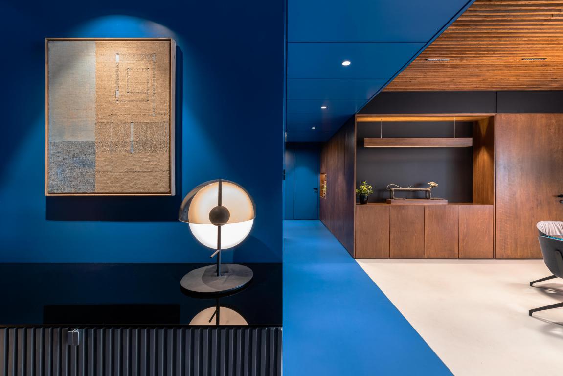
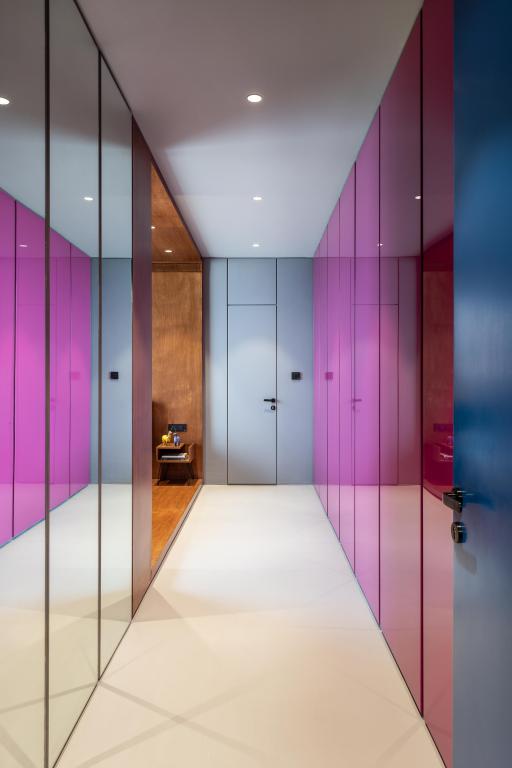
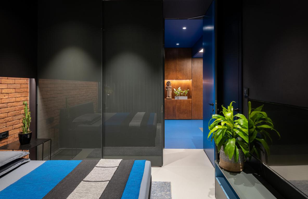
The apartment has a generous lobby external space. A small bench was placed near the entrance next to the Nameplate, which was fabricated in Corten steel. As you enter the apartment, you are greeted by this continuous volume of blue that stretches till the lobby of the bedrooms. All the surfaces connected to this volume (floor, wall and ceiling) were rendered in blue to make it look like a chuck of volume subtracted from the overall space. This move played as the central pivotal idea of the entire space—the reason why it is named Blue Scoop Haus.
Also Read: From Baoli Wall to Tropical-Inspired Furnishings and Murals, to Ratan Back Armchairs, Blue Baoli Has Everything to Mesmerize You
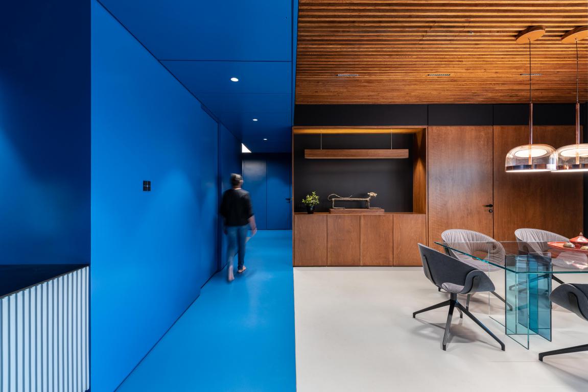
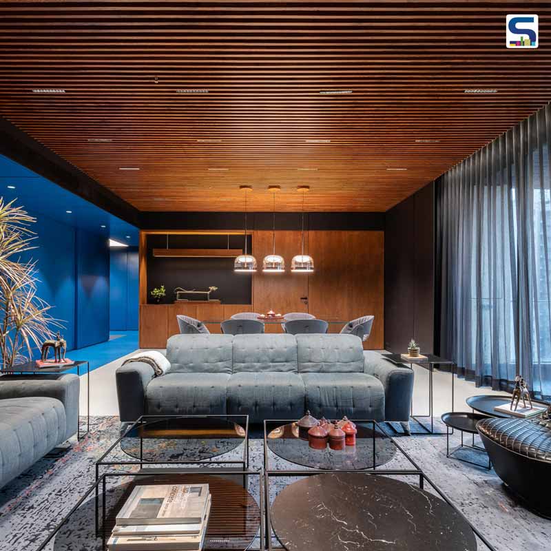
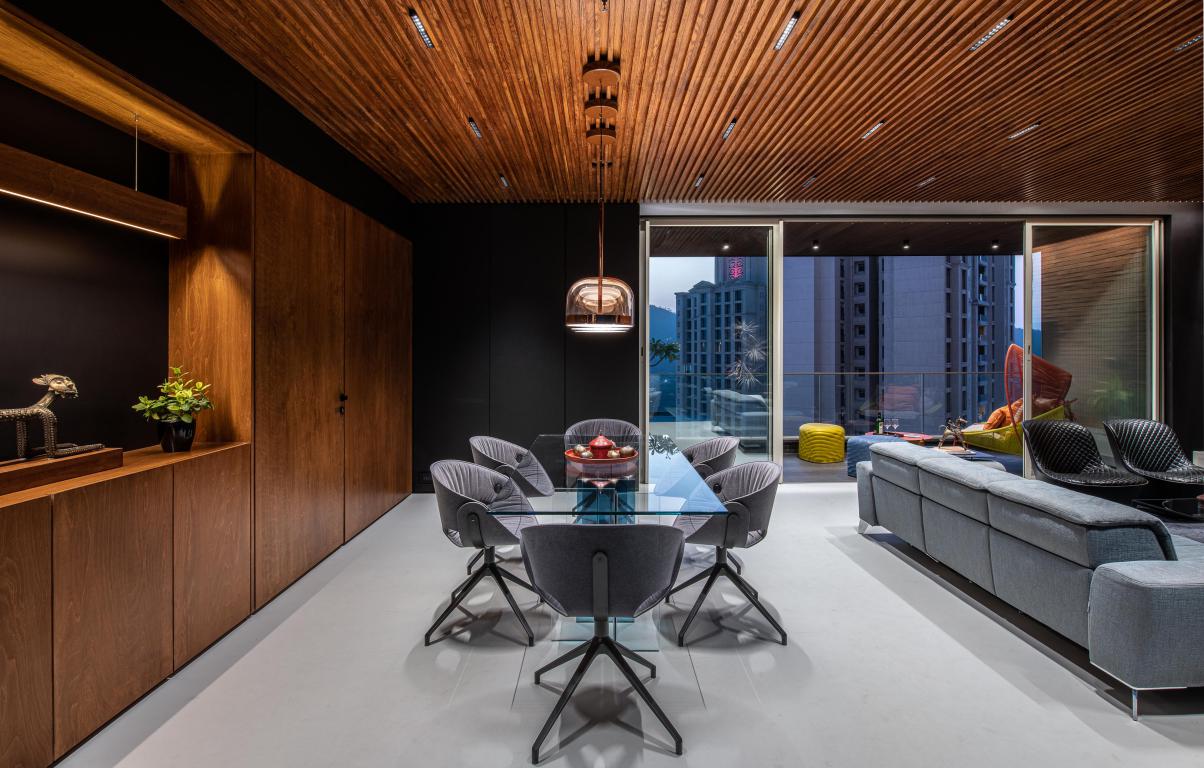
From this entrance passage, you come out in the large living room. The living space accommodates formal seating and an eight seater dining space.
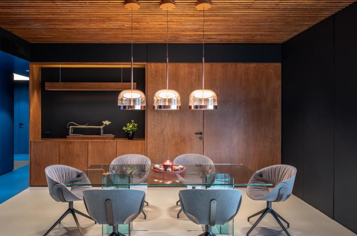
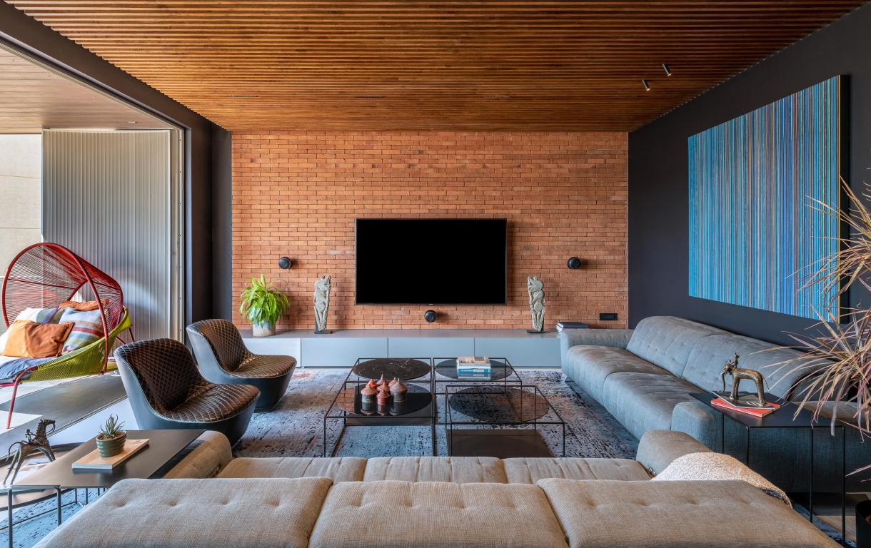
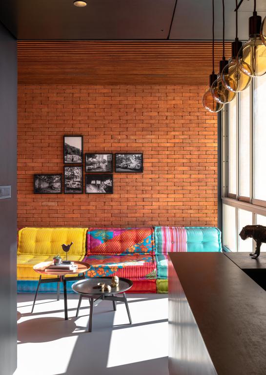
The material palette for this space is a slatted Oakwood ceiling, concrete floor, Godhra Bricks, Birch plywood etc. All these materials get offset against a slew of jet black colour. Connected to living is a compact lounge space. ‘L’ shaped Mah-jong sofa from Roche Bobois spans the entire length and breadth of the area.
As you move from the living room to the personal through this blue mass of the passage, you are greeted by a comfortably placed open pooja space in the corner of the lobby.
.jpg)
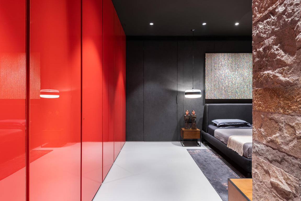
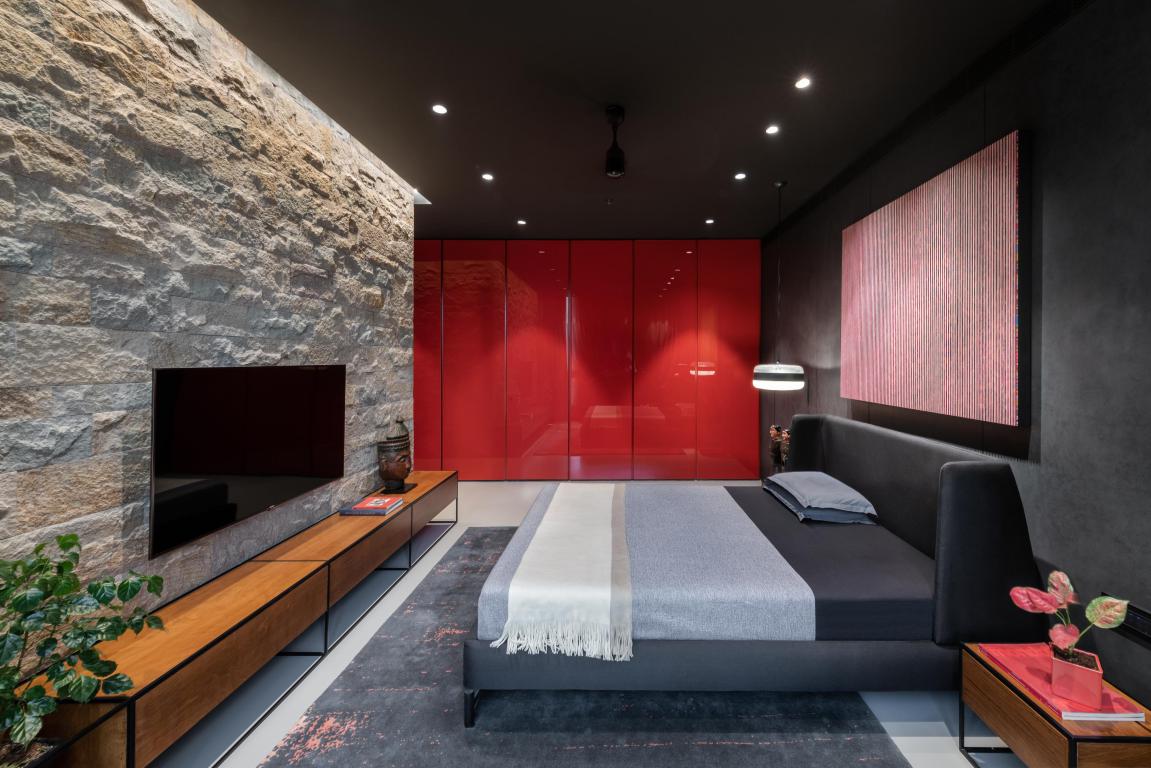
Master bedroom is in the same line ahead of where the living and lounge are located. The material palate of this space is a concrete floor, rough-cut stone, charcoal coloured thing tile and red black painted wardrobe.
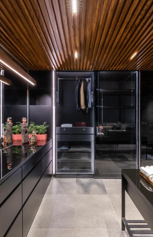
Attached to the bedroom, on the rear side lies the master bathroom with a walk in wardrobe. There is no formal separation between the wardrobe space and bathroom space. The material palate for this space constitutes of river-washed slate stone, tinted glass sliding wardrobes with the wooden slatted ceiling.
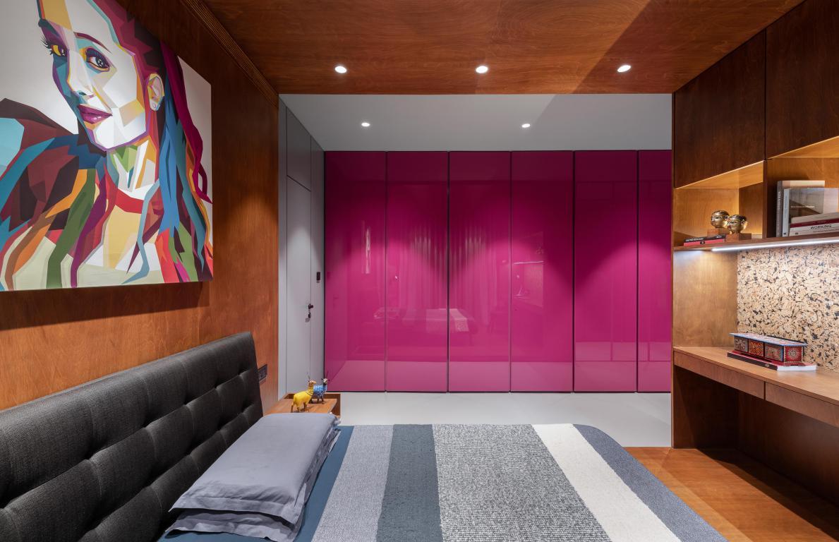
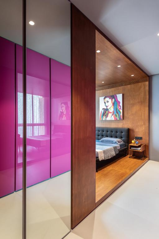
The space on the left side of the master bedroom is the daughter’s bedroom.
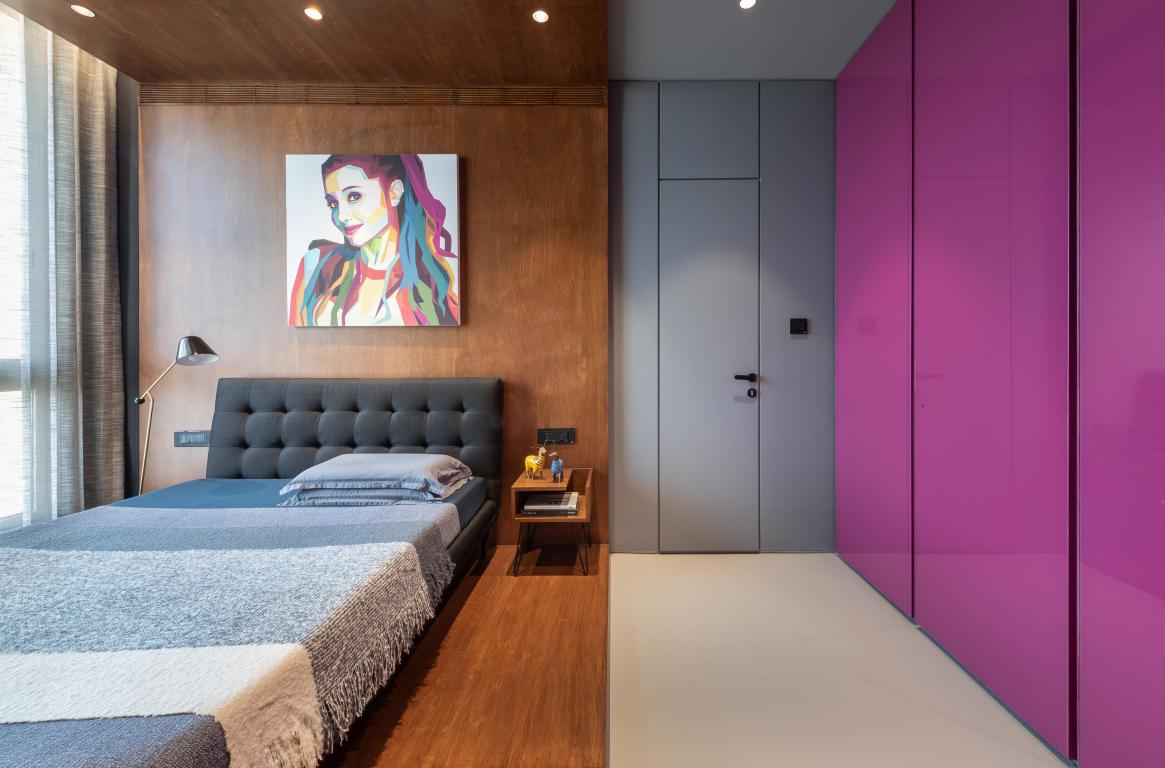 We have made large mirrored cabinets that hold shoes and other knick-knacks at the very entrance of this space on the left-hand side. The entire length on the right-hand side of it is a fuchsia coloured wardrobe made in back-painted glass openable shutters. The main bed space is a wrap of birch plywood which houses the bed and study at the other end of it.
Also Read: Studio Saransh Uses Teak, Concrete and Splash of Blue in the Interior of MD Apartment
To the bottom of the daughter’s bedroom is the guest bedroom.
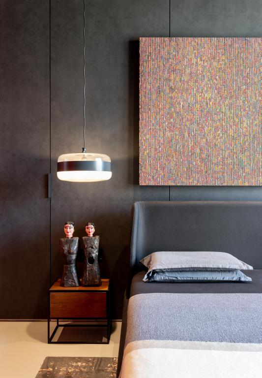
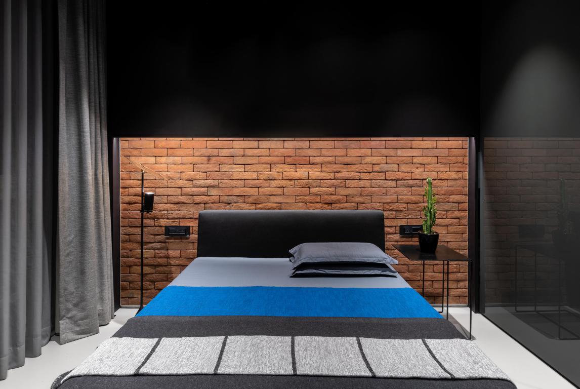 Compared to the other spaces, the size of this room is a bit restricted. The colour palette of this room is dictated by dark monochromatic colours with an accent of blue.
The kitchen is right next to the living space and opens into the dining crossing the blue passage.
Prominent Use of Bold Colours
The playful use of bold colours is the key element of Indian culture. The subtle yet definitive use of colours to connect with space without being overwhelming and out of sync presented a new challenge. The mainstay of the theory is the large volume that starts right from the entrance spanning until the individual rooms lobby. This volume has been termed ‘The Blue Scoop’.
The design intent for it was achieved by having all the surfaces connected to this volume in a single tone of the colour (Blue). This move creates an illusion of a chunk of mass being subtracted (scooped) and separated from the overall volume. Keeping the spaces muted around this scoop further ensures that there is an emphasis on this space being the mainstay of design.
Another example of inspired use of colour is how the colour black is used in the space. Black, which is typically considered taboo, can offer a new interpretation of other colours and elements around it if used wisely. In this project, the colour black provides a contrast and context to the other colours. The other colours like scarlet red and magenta the firm chose as per the client personalities, preferences.
Material Palette
The overall material palette is a concrete floor, birch plywood, Oakwood for ceilings, Godhra bricks, rough-cut stones, back-painted glasses in different colour tones and most importantly, black colour to form the background for each material.

Also emphasis was laid on using authentic material and not their replica. For eg. the firm ended up using Godhra Bricks for the wall cladding purpose while there are a lot of artificial replicas available for the same in the market for the ease of using them as an interior material. Likewise, for wall cladding of the master bedroom, they used Porphyry rough-cut stone instead of any ceramic tile. Below are the details of each one.
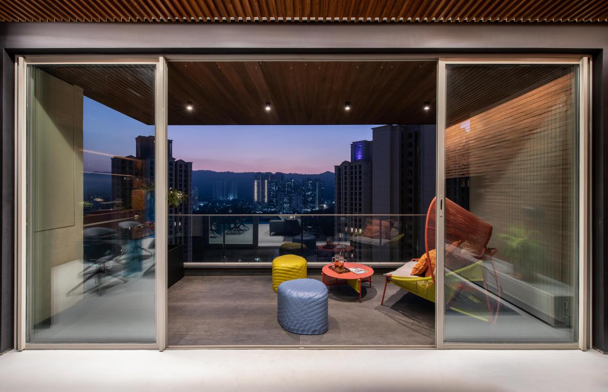
The striking house covers 2200sqft Carpet + 80sqft Balcony, creating a feeling of scooped through colour theory.
Brick wall: The bricks used for cladding are authentic bricks tiles sourced from Godhra. The use of bricks is associated with Indian living. Therefore, to impart rusticity in the semi-public spaces, the living wall and the opposing lounge wall were cladded by the same. By making that move, it became easier to connect these symmetrically opposite spaces.
Stone Wall: The stone wall in the master bedroom is made up of Porphyry stone in rough cut finish. The stone came in three different sizes and was arranged to form asymmetric pattern bound by an aluminium ‘L’ shaped end profile. At site each stone was laid out in grid on the ground before its installation to make the natural color variation was evenly distributed. Same process was followed where the natural stones were to be installed throughout the apartment.
Also Read: A beautiful door done with teak, finished in cobalt blue distressed paint
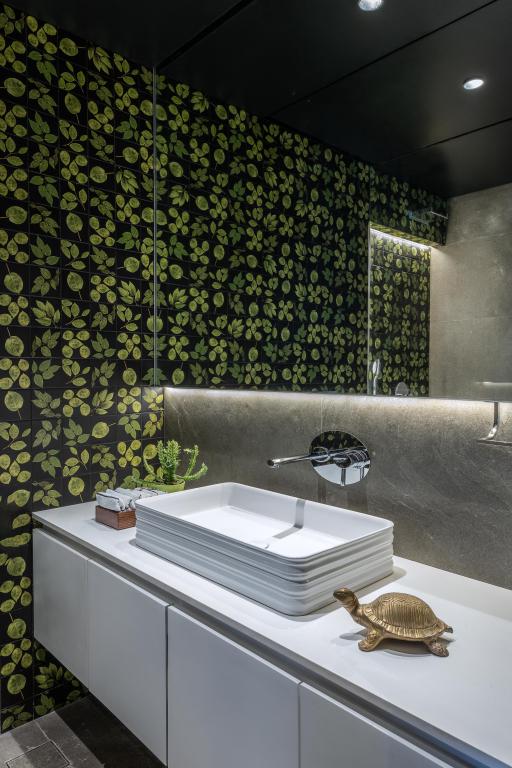
Turkish Grey in river wash finish was used in daughter’s bedroom. Midnight black in suede finish was used in master toilet. Finally, Porphyry in rugged finish was used in powder room.
Wood Panelling On ceiling: In the living and lounge, the use of timber slatted ceiling primarily connects the two spaces on visual terms divided by powder room. Also Clean linework is one of the strengths of the overall apartment. The linear one-dimensionality of the slats adds to the assumed aesthetic in that respect.
Challenges
On asking about the part of the space they enjoyed designing the most or which is their favourite space in the house?, the firm said, “Unarguably, it would be the living and lounge space. There are multiple reasons for this. One of them was finding a design solution to connect the lounge to the living room seamlessly. There were multiple hurdles in achieving the same, first being taking care of existing services those originated from the attached bathroom and cut across the length to run into the nearest duct.”
“We had to work sectionally to make sure that all those pipes were concealed into the ceiling and at the same time enough access was provided to them to make the serving of them on easier terms. Secondly, we had to find a modular solution to enclose the lounge from living at times for privacy. To achieve this, we had to design a couple of doorways that could be parked on either side and merged into the aesthetic in its open state. Thirdly, we now could insert the bar into the transition space of living and the lounge,” they continued.
Also Read: A House That Gives Uber-Luxe Vibes to the Inhabitants | The Auura Interior Design Studio | Rajkot | Adani Shantigram
 While shedding light on the design philosophy, the firm said, “One thing we try and achieve is the consistency for each design intent. The attempt is to explore any design intent in the most consistent way. More often than not that becomes the highlight of the project. In this project it was a volumetric approach towards colours as we have already stated. The idea was to be consistent with this central theme throughout the space.”
Choice of Artwork and Furnishings
The artwork throughout the apartment is woven like a thread through spaces. “The artwork in living and master bedroom is from a noted artist Yuvan Bodhisathuvar. Both pieces of art are 3D in nature more like an installation. They change in colour and texture as you move from one point to another. The artwork at the entrance is from Manish Nai. The basic material of this one is jute. Lastly we chose to go for vintage car B/W images from Shahid Datawala in the lounge area with a backdrop of Godhra bricks.”
There was a deliberate attempt made to go abstract (by the fabric choice) with the choice of lounge sofa to relate to the personality of the space. The sofa name is Mahjongg from Roche bobois and noted fashion designer Kenzo Takada has designed the fabric. It spans the entire length and width of the space.
Project Details
Project Name: Blue Scoop Haus
Architecture Firm: DIG Architects
Firm Location: Vile parle east, Mumbai
Completion Year:2019
Gross Built Area: 2100 sq.ft.
Project location: Thane west
Lead Architects: Ar. Amit Khanolkar & Ar. Advait Potnis
Photo credits: Sebastian Zachariah
Photographer credits: PHX India
Name of spokesperson/person: Amit Khanolkar, Advait Potnis
Designation: Principal Architects
Team
Design Team: Ar. Samadhan Mhatre (designing), Ar. Fenil Gala (project management)
Client: Mr. Kapil & Ashwini Pathare
Graphic design: Ashutosh Gavit
Keep reading SURFACES REPORTER for more such articles and stories.
Join us in SOCIAL MEDIA to stay updated
SR FACEBOOK | SR LINKEDIN | SR INSTAGRAM | SR YOUTUBE | SR TWITTER
Further, Subscribe to our magazine | Sign Up for the FREE Surfaces Reporter Magazine Newsletter
You may also like to read about:
A Living Home Interior Design For A Couple Who Are in Their Mid-Fifties | Juhu | Mumbai
Minimalism to convey luxury in Ar Anurag & Pallavi Pashine’s residence | Salankar Pashine & Associates | Nagpur, Maharashtra
A Beautifully Crafted Luxury Residence by Dipen Gada
And more…